 Time to say goodbye to Calibri! After nearly 15 years, Microsoft is replacing its default font and is sourcing feedback for selecting the new one via Twitter. The company has commissioned five new custom typefaces to replace Calibri (sadly no Comic Sans) and is asking the public to vote on their favorite. Here are the contenders:
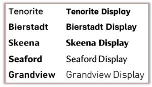
Tenorite
Tenorite looks like a traditional workhorse sans serif font, but a little friendlier. It was designed by Erin McLaughlin and Wei Huang, and notably uses large dots, accents, and punctuation that make it comfortable to read at small sizes.
Bierstadt
Bierstadt, designed by Steve Matteson, is a precise serif inspired by mid-century Swiss designs. The name comes from one of Colorado’s 14,000-foot peaks. “When I think of Swiss type, I think of the Alps, and since I’m based in Boulder, my Alps are the Rockies,” Matteson said.
Skeena
This sans serif by John Hudson and Paul Hanslow may be the quirkiest of the bunch, while still being compact and readable as body text or presentation titles.
Seaford
This “gently organic and asymmetric” sans serif by Tobias Frere-Jones, Nina Stössinger, and Fred Shallcrass is like a warm hug, or a cozy reading nook, or a cup of tea. Something makes you want curl up in it. That’s kind of what the designers were going for.
Grandview
This sans serif typeface by Aaron Bell is derived from old German road and railway signage, which was designed to be legible at a distance. Its roots in signage give this one a mechanical but sophisticated vibe.